Colourful indoor plant pots turn ordinary houseplants into eye-catching design features without requiring a full home renovation. A single bright ceramic planter on a side table or a curated cluster of vivid containers along a windowsill can shift the entire energy of a space in seconds.
Having spent years experimenting with dozens of pot styles, materials, and colour combinations in my own apartment and recommending setups for readers, I can tell you this: the container matters almost as much as the plant inside it. This guide draws on personal testing, verified market data, and current design research to help you select vibrant indoor planters with real confidence.
Below, you will find everything from trending pot colours and material comparisons to room-by-room placement strategies and plant-pairing advice written so you never need to click away for a second opinion.
Table of Contents
Why Bright Plant Pots Have Become a Home Decor Essential
Vibrant houseplant containers are no longer a niche choice. They have entered the mainstream because homeowners now treat indoor greenery as a core element of interior styling rather than a decorative afterthought.
The numbers reflect this shift. According to Mordor Intelligence’s 2025 market report, the global indoor plant market reached an estimated USD 22 billion in 2025, growing at a compound annual rate above 4%. As plant ownership rises, demand for distinctive, colourful ceramic plant pots and decorative indoor planters has climbed alongside it.
Business Research Insights further notes that social media platforms have meaningfully accelerated indoor plant adoption, particularly among millennials who gravitate toward photogenic, bold-coloured pots that perform well in visual content.
Three key forces drive this movement:
- Compact urban living apartment dwellers cannot easily swap large furniture pieces, so replacing a dull grey pot with a coral or teal planter delivers immediate visual impact at minimal cost.
- The rise of biophilic design architects and interior designers worldwide now integrate natural elements into living spaces, and bright plant containers amplify that nature-forward aesthetic.
- Proven wellness benefits a study published in the Journal of Physiological Anthropology found that interacting with indoor plants measurably reduces physiological stress indicators such as blood pressure and heart rate. Surrounding those plants with cheerful colours deepens the mood-boosting effect.
Trending Colours for Indoor Plant Pots in 2026
Picking the right shade depends on three things: your room’s existing palette, the foliage colour of your chosen plant, and the atmosphere you want to create. Here is a practical reference table pairing popular pot hues with suitable decor styles and houseplant companions.
| Pot Colour | Suits This Interior Style | Strong Plant Pairing |
| Terracotta Orange | Boho, Mediterranean | Aloe Vera, Cacti, Succulents |
| Sage Green | Scandinavian, Minimal Nordic | Snake Plant, ZZ Plant |
| Soft Pastel Pink | Romantic, Soft Contemporary | Orchids, Peace Lily |
| Cobalt Blue | Coastal, Eclectic | Golden Pothos, Trailing Ivy |
| Sunshine Yellow | Playful, Maximalist | Boston Fern, Calathea |
| Deep Teal | Moody Art Deco, Modern Glam | Burgundy Rubber Plant, Monstera |
| Lavender | Feminine Contemporary | African Violet, String of Pearls |
Plantagen’s 2026 pot trend forecast highlights pastels, warm Mediterranean earth tones, and handcrafted glazed finishes as this year’s dominant colour stories across European homes. Meanwhile, Accent Decor’s product design team confirms that reactive, hand-applied glazes producing one-of-a-kind colour variations remain the standout choice among independent plant shops and garden centres.
How to Pick the Right Material for Colourful Indoor Planters
The material you select determines not just how a pot holds its colour, but also how well your plant’s root system thrives. Each option presents distinct trade-offs.
Glazed Ceramic and Stoneware
Glazed ceramic is far and away the most versatile material for colourful houseplant pots. Modern kiln-fired glazes can reproduce virtually any shade, from muted earth tones to electric neon. High-gloss finishes intensify rich hues like emerald and cobalt under natural light, while matte glazes soften them into more understated tones.
From a horticultural standpoint, ceramic retains moisture longer than porous materials. That characteristic makes it well suited for tropical species ferns, orchids, calathea that prefer consistently damp soil. The downside is weight; a large glazed container can be cumbersome to relocate once planted.
Painted and Dip-Dyed Terracotta
Raw terracotta remains a favourite among succulent and cactus growers because its porous walls allow rapid air exchange and quick soil drying. When hand-painted or dip-dyed, terracotta gains a charming artisan quality that slots perfectly into bohemian and Mediterranean-inspired rooms.
One practical consideration: exterior paint can chip with repeated watering cycles. I recommend seeking pots finished with a sealed topcoat, or applying a clear matte sealant yourself to extend the vibrant colour’s lifespan.
Fibreglass and Lightweight Resin
For anyone wanting large, statement-sized vivid planters without dealing with extreme weight, fibreglass and resin composites are the practical answer. These materials replicate the look of ceramic, concrete, or even hand-thrown clay at a fraction of the mass. They resist temperature-induced cracking as well, making them reliable options for sunrooms, conservatories, and covered balconies where conditions fluctuate through the day.
Styling Colourful Plant Pots Like a Design Professional
Colourful indoor plant pots deliver the strongest visual payoff when arranged using deliberate techniques rather than random placement. Here are three styling methods I use repeatedly and recommend to anyone building an indoor garden display.
Cluster in Odd Numbers
Arrange bright plant containers in groups of three, five, or seven. Odd-numbered clusters feel organic and prevent your setup from looking rigid. Within each group, vary the pot heights, diameters, and colour saturation so your gaze naturally travels across the arrangement.
Apply the 60-30-10 Colour Ratio
Interior designers rely on this proportion for balanced rooms, and it works just as well with planters. Assign 60% of your collection to a soft dominant tone, 30% to a complementary secondary hue, and reserve 10% for one bold accent colour. For example: three matte sage pots, two dusty blush containers, and a single vivid cobalt planter strikes a lively yet harmonious note.
Contrast Foliage Against the Pot
Dark-leafed varieties such as rubber plants and ZZ plants pop against pale or pastel containers. Light green trailing species like pothos and string of hearts look dramatic inside deep jewel-toned pots think navy, emerald, or wine. Soltech’s 2026 design guide reinforces this principle, noting that today’s plant pots have evolved into central design elements intended to shape the mood of an entire room.
Room-by-Room Placement Guide for Vibrant Indoor Planters
Where you position a colourful pot matters as much as the pot itself. Each room offers distinct opportunities.
Entryways and hallways a single bold floor planter holding a tall species like bird of paradise creates an immediate sense of welcome without overwhelming a narrow corridor.
Living room shelves and consoles line up a mix of small-to-medium bright ceramic pots at staggered heights. Alternating warm and cool tones builds visual depth across the shelf.
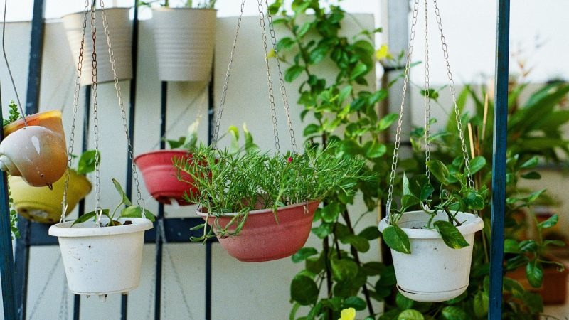
Kitchen countertops and windowsills compact, cheerful containers in sunshine yellow or coral suit herbs like basil and rosemary. The colourful pot energises what can otherwise feel like a purely functional zone.
Home office desks choose a single calming hue like teal or lavender. Research from Washington State University found that participants working near plants were roughly 12% more productive and reported lower stress levels. Adding a pot colour you personally enjoy reinforces that positive cognitive association.
Bedrooms opt for muted pastels or soft earth-toned planters to support a restful atmosphere. Low-maintenance species like snake plants, which release oxygen at night according to Healthline’s plant science review, pair perfectly with calming container colours.
Choosing the Correct Pot Size for Your Plants
Even the most stunning colourful planter will fail your plant if the sizing is wrong. An oversized container traps excess moisture around roots and invites rot, while a cramped one restricts growth.
| Plant Category | Ideal Pot Diameter | Recommended Placement |
| Small (succulents, herbs, air plants) | 10–15 cm / 4–6 in | Windowsills, desks, floating shelves |
| Medium (pothos, peace lily, philodendron) | 18–25 cm / 7–10 in | Side tables, countertops, bookcases |
| Large (monstera, fiddle leaf fig, rubber plant) | 30–40 cm / 12–16 in | Floor corners, entryway, beside furniture |
Soltech’s pot guide advises increasing diameter by only 5–10 cm during repotting. Jumping straight to a much larger decorative pot is a common mistake that leads to soggy soil and root decline, regardless of how attractive the container appears.
Always verify that your colourful planter includes a drainage hole, or use a nursery insert with a saucer inside the decorative outer pot to prevent waterlogging.
Maintaining Colourful Pots and the Plants Inside Them
A vibrant multicoloured flower pot loses its appeal if the plant within looks neglected or if the pot itself fades. A few simple care habits keep both in peak condition.
Glazed ceramic and painted containers retain moisture substantially longer than unfinished terracotta. Before watering, insert a finger into the top two centimetres of soil. If it still feels damp, wait another day. Overwatering remains the leading cause of houseplant death, and decorative pots without efficient drainage make it worse.
Dark-coloured planters absorb more heat when placed in direct sunlight. This raises soil temperature, which can stress sensitive root systems over time. If you favour deep-toned containers like navy or black, position them in bright but indirect light rather than full afternoon sun.
Wipe the exterior of glazed pots with a soft damp cloth every few weeks. Hard water leaves chalky mineral deposits on colourful surfaces, dulling the gloss that attracted you in the first place. A splash of diluted white vinegar removes stubborn build-up without damaging the glaze.
Conclusion: Let Your Planters Reflect Your Personality
Colourful indoor plant pots accomplish something no neutral container can they communicate your taste, enliven your spaces, and turn routine houseplants into genuine conversation starters. By selecting the right colour, material, size, and placement for each room, you build a home that feels both thoughtfully designed and deeply personal.
If you are new to vibrant planters, begin with a single swap: replace one plain pot on your desk or kitchen counter with something in a shade that genuinely excites you. Notice how that one change shifts the mood of the space. From there, building a full collection of bright indoor planters becomes an enjoyable and almost addictive process.
Tried a colour combination that worked brilliantly in your home? Drop it in the comments below sharing real-world results helps every reader make better choices.
What are the most popular colours for indoor plant pots right now?
Sage green, terracotta orange, soft pastel pink, and deep teal are among the most sought-after colours for indoor planters in 2026. Trend forecasters atPlantagen highlight handcrafted pastels and warm Mediterranean tones as dominant styles this year. The best colour for your home depends on your existing decor palette and the foliage shade of the plant you intend to pot.
Do colourful plant pots have any effect on plant health?
The colour of a pot does not directly influence plant growth, but darker containers absorb more solar heat, which can elevate soil temperature and stress roots in direct sunlight. Choosing a lighter-coloured pot or placing dark planters in indirect light keeps soil conditions more stable and plant-friendly.
Which material holds bright colours best for indoor planters?
Glazed ceramic provides the broadest and most durable colour range because kiln-fired glazes bond permanently to the clay body. Fibreglass and resin also hold vivid shades effectively and weigh significantly less, making them ideal for large floor planters. Painted terracotta offers a charming handmade look but may require periodic resealing to prevent chipping.
How do I coordinate colourful pots with my room’s decor?
Apply the 60-30-10 interior design ratio: keep 60% of your pots in a neutral or soft dominant colour, 30% in a mid-tone accent, and 10% in a bold statement shade. Draw your accent colour from an element already present in the room a throw pillow, area rug, or piece of art so the planters feel connected rather than random.
Are vibrant indoor planters more expensive than neutral ones?
Not necessarily. While hand-glazed artisan pieces and designer ceramic pots carry a premium, many retailers and online plant shops stock colourful options in ceramic, resin, and painted terracotta at accessible price points. Budget-friendly bright planters start at just a few dollars, so refreshing your indoor garden with colour does not require a significant financial commitment.
Where is the best place to position colourful plant pots indoors?
High-traffic spots like entryways, living room shelving, kitchen windowsills, and home office desks benefit the most from a pop of colour. Research fromWashington State University suggests that proximity to plants in a workspace can improve productivity by around 12%, so a cheerful planter on your desk serves both aesthetic and functional purposes.